
Smart Parking for JUMP Bikes
Building responsible use of dockless e-bikes in San Francisco

OVERVIEW
Stop the bike littering
At the start of 2018, the San Francisco Municipal Transportation Agency (SFMTA) awarded JUMP with the city’s first permit to operate dockless bikes. However, riders left improperly parked bikes everywhere making them a public nuisance. JUMP wanted riders to use its bikes in a socially responsible way to ensure the city would not revoke its permit and leave its business with a negative brand image.
TEAM & DURATION
My Role
I worked alongside two other designers (Winnie Huang & Lindsey Hoshaw) to complete this concept project for General Assembly SF during a two-week sprint. I worked as a UX/UI Designer conducting user research, making prototypes and testing them before creating a clickable prototype of the bike computer UI. The project only involved UX Design and stopped at the point at which it would be sent to Engineering for a review on feasibility.
TOOLS & METHODS
What worked?
Daily task updates on Slack
User interviews
Affinity mapping
Defining an archetype
User flow
Interaction design
Rapid prototyping
Usability testing
Clickable prototype
GAINING INSIGHT
Get messy early and stay in it a while
Getting to know San Francisco bike riders
With no pre-existing user data or a defined problem to solve, we needed to gather as much qualitative data as possible to begin sifting through the information and figure out bike riders’ pain points and goals. We conducted 20 user interviews which helped us gain deeper insights into behavioral patterns of bike riders and their emotional needs. From this, we developed JUMP’s archetype.

Whiteboarding during data synthesis
Key insights:
Personal attachment: I have a strong personal attachment to my bike.
Save money: I want to save money on my commute, so I can spend it on other things that make me happy.
Safety: I want to feel safe.
Altruism: Doing good makes me feel good.
Reliability: I want to be a punctual/reliable person, so I need to have an easy, convenient commute plan.
For more details behind the insights, check out the JUMP affinity map.

JUMP archetype
THE PROBLEM
Am I doing the right thing?
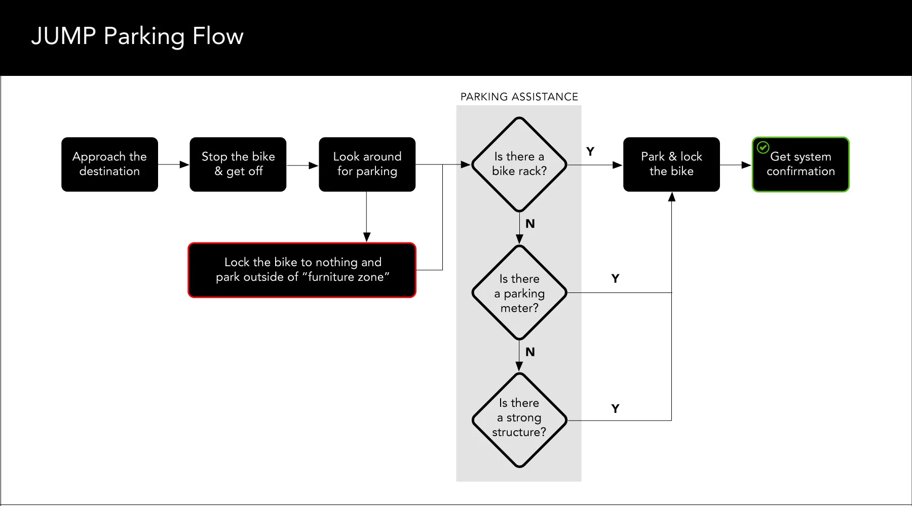
Since the assigned business problem was to stop bike littering, having riders park and lock their bikes correctly is essential to maintaining a healthy bikeshare ecosystem — return it properly so the next rider can find and use it. Although bike riders want to use the bikes responsibly by locking and parking correctly, they’re not sure whether or not they’ve actually done so. They assume they’ve done it properly once they lock the bike and are no longer charged for its usage.

Technically “locked” but not actually locked or parked correctly.
SOLUTION OVERVIEW
Give riders direct feedback when parking
The big idea is to offer bike riders a connected feedback experience between the digital and physical space to help guide them in their bike parking and locking decisions. From our competitive analysis, all other bikeshares provided maps displaying parking zones.

Competitive analysis
DESIGN DELIVERABLES + OVERVIEW OF DELIVERED SOLUTION
Integrating the bike computer with the Uber app
We designed screens to complement both the existing bike computer UI and mobile app with a focus on providing riders with feedback and parking assistance at the end of their ride.
Solution - Part I: Parking assistance in the digital space
I created and tested two iterations of paper prototypes for the bike computer screens. Usability tests resulted in some consistent but conflicting user feedback:
Users needed to see a map of parking locations.
Users did not want to use their phones during the bike ride.
So how do you provide parking assistance in a way that’s non-disruptive to the bike ride? Start with the bike computer interface with an option to send to mobile, so the user can make sure they’ve stopped and are ready to receive parking assistance.
For context, this is the bike computer UI:

Here’s the link to the clickable prototype.
Here are the bike computer screens I designed to integrate feedback sent to the mobile app on parking and locking.
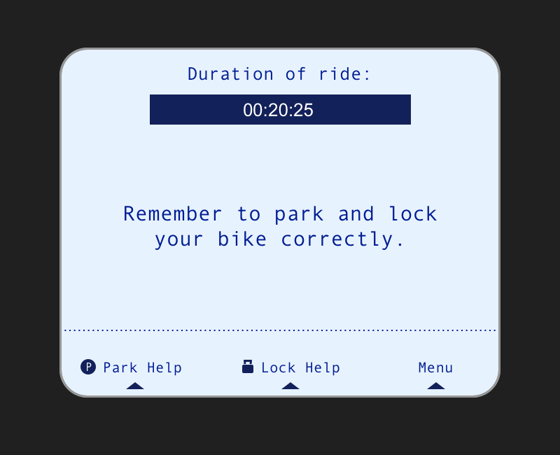
Bike screen 1
“Duration of ride” (top-center of the screen) displays the amount of time the user has been riding the bike, serving as a visual cue that charges are still accumulating for the ride. It stays at the top of the screen until user navigates to “Park Help”, “Lock Help” or “Menu”.

Bike screen 2
Error message (center of the screen) lets user know they’ve parked in an incorrect spot.
If user clicks “Park Help” (bottom-left corner of the screen), then user is taken to a map view displaying suggestions for nearby parking spots.

Bike screen 3
Map displays suggested nearby parking spots.
If user clicks button number “1” or “2” on the bike computer keypad, then user goes to a screen with parking directions.

Bike screen 4
Distance to parking spot (top-center of screen) is displayed. All spots should be within 20-ft or less.
List of directions gives clear navigation to parking spot.
If user clicks “Send to Mobile” (bottom-center of the screen), then map directions are sent to mobile app.

Bike screen 5
Confirmation message (center of screen) is displayed.
If user clicks “Hold Bike” (bottom-left corner of screen), then accumulation of time/charges is paused.
If user clicks “End Ride” (bottom-right corner), then user stops accumulation of time/charges.

Bike screen 6
“Thank you” message ends interaction with bike computer. Push notification is sent to user’s mobile app with final confirmation message and summary of charges.
Solution - Part II: Model how to park and lock a bike
Display properly parked and locked bikes in high-demand areas such as San Francisco’s Financial District and major public transit stations.
RESULTS & REFLECTIONS
Lots of insights and unanswered questions
Given the short duration of this design sprint, I am confident our methodologies and findings moved in the right direction.
Future considerations
One week after we delivered our concept project, JUMP released newly updated bikes in San Francisco. The following changes were noted:
Cable locks replaced the U-lock mechanism.
The bike computer system moved from the back of the bike to the front (no longer having a screen).
A mobile phone clip was added to the front.
These changes seem to reflect JUMP’s desire to turn personal smartphones into the main computer system to be used by the rider. With this focus moving solely towards interacting with the mobile app, a possible idea to consider might be that a push notification is sent to mobile to initiate “AR parking assist” once the bike motion sensors determine a rider has stopped biking.

AR parking assist
AR parking assist becomes available on mobile when bike is stopped. User holds the smartphone up to street view to see all available parking spots clearly marked.
Food for thought:
In contextual inquiries and usability tests, bike riders repeatedly mentioned they do not want their phones to disrupt the bike ride in any way. It’s worth considering that while riding a bike, multitasking is almost impossible, especially in heavily trafficked urban areas. Bike riders need full awareness of their surroundings to avoid a major bike accident. This goes back to one of our key insights: “Safety”. In one of our user interviews, a rider was quoted saying “If the bikeshares were safe, I would rent again.”